domingo, 19 de octubre de 2014
martes, 10 de junio de 2014
miércoles, 9 de abril de 2014
martes, 25 de octubre de 2011
jueves, 20 de octubre de 2011
SaphireNishi old stuff
 |
| Some old VRay render |
 |
| Some old Poser render |
 |
| Some old Poser render |
 |
| Some old Poser render |
 | |
| Some old Poser render |
 | |
| Some old Poser render |
Etiquetas:
nishi,
old stuff,
saphire,
saphirenishi
sábado, 23 de mayo de 2009
Vue tutorial, for begginers like me
OK, first of all, thank you to Lolaa, Rena and Alex for this idea, I hope this helps you, the Rendered community people and anyone who reads this.
Let's start. After you install Vue and try to import Poser scenes, objects, etc. the program will ask you to specify a folder where your Poser executable file is, you'll have to locate that folder, it can change depending on the version of Poser you use. I use Pro, therefore, my file is C:/Program Files/Smith Micro/Poser Pro (in other versions change Smith Micro for Curious Labs or e-Frontier). Once there, you only have to double-click the icon that looks exactly like the Poser icon on your desktop (the .exe file). It may ask some questions depending on your PC performance and/or video card. Ready, now you can import Poser stuff to Vue.
All right, to start,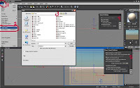 click on the File tab (No. 1) and then Import object (No. 2), this will bring the Open window on No. 3, you will have to locate the folder where you store all your poser scenes. This will open the Import options window in No. 4, click OK, and it will take a few seconds (depending on your PC) before it shows the Poser Import options. These last options may affect your system's performance, that's why I didn't check the "Allow re-posing inside Vue" option.
This leads me to a really cool feature. If you don't like something in your scene once inside Vue, you can open it in Poser (you don't need to close Vue if your system can handle it), do all the necessary changes in Poser (pose, Mats, hair, clothes, etc.), save it and Vue will ask you automatically if you want to load the new changes, just say yes and it'll repeat No. 4 and 5, and voilá, the scene will update.
Note: Vue is a very whimsical program and it will crash with any provocation, so, try to save your progress as often as you can. Also, if you have a very heavy scene in Poser, say, 3 or 4 human figures and props, try to save the figures with their respective props as different scenes and load them into Vue separately.
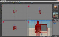 This is how your screen looks once the object or scene is loaded.
No. 1, 2, 3 and 4 are your preview screens. 1 is from the top, 2 is from the left side, 3 is the front view and 4 is where your scene renders when you click "render" (I'll get to that later). Each window has a small camera icon on the top right corner, this allows you to render each individual screen so you can see if everything's going OK. You can left-click over any of them to activate it (the top bar of the screen you select will turn blue), and you can use your mouse wheel to zoom in or out on any of these four screens. No. 5 is where you get a more accurate preview, it updates after you make any change to the scene. This takes resources, so, you can turn it off by right-clicking over it and unchecking the Auto update option.
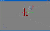 The gray line you see in the middle is the ground. If your figure appears in the middle, all you have to do is pull it up using the arrows around it (No. 1). If you ever built anything in Second Life, you may find this very similar, therefore, making it easier to use. With these arrows you can move anything in the scene: the ground, your figure and even the sun. With the dots you see in No. 2 you can change the size of the selected figure. The corner dots resize evenly, and the middle dots will resize unevenly, this could deform your figure. The icon in No. 3 activates the arrows to move the selected object in any direction. The letters next to it change the arrows' direction so you can move the object in a diagonal and towards the camera. No. 4 allows you to rotate the object, the letters affect the rotation as well.
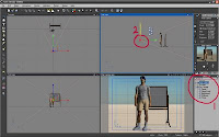 In this image, you can see the list of all the objects in the scene. If you right-click on anything in this window, you get a lot of options, you can group several objects, ungroup them, delete or edit them, etc. If there is a cross on the left of the object, it means that it's a group. For example: the Ozz Tutorial scene. It's made of 5 different figures: Ozz, the T-shirt, shorts, boots, and the blackboard. If you expand the menu, you can select each of them and move them, transform them, etc. individually.
In this image I selected the camera (No. 1) to show you that you can move it just like any other object. The pink dots in the top, front and side viewers show the camera's field of vision, and there's a line in the middle that shows you the center of the field.
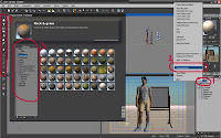 Now, let's move to fun stuff. I'll show you how to change materials. In this image I right-clicked on the ground (No. 1) and then selected Change material (No. 2). This opens a window (No. 3) that gives you a lot of options of materials. You can turn the ground, or any object, into whatever is included in the menu: metals, glasses, liquids, etc.
Before I go into No.4, I'll add that almost all of the buttons in Vue can be left and right-clicked with different results, right usually brings up menus, so, experiment on all of them.
OK, the buttons in No. 4 add different things, from water to planets (for the background) to plants and trees. Just go ahead and try them all.
 You can see in "A" on this image that I changed the ground into a green-grassy material.
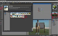
In this image I right-clicked the Tree button (No. 1) and I got that window. You can see that you have a lot of options for plants, trees, bushes, etc. You even have underwater plants. Go crazy and experiment with anything you want to put into the scene.
I selected a huge Baobab tree (No. 2) by double-clicking on it.
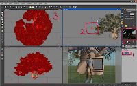 You can see in "A" on this image that, after I resized and relocated it, the tree is blocking the sunlight. What do we do now? Well, you have several options. One is to select the tree (No. 1) and rotate it or move it out of the way (No. 3), or you can select the Sun light in the list and move it around till the light is better for the image. This can be difficult with a tree as large and bushy as the baobab, you'd need to lower the light too close to the ground and that affects the results. Also, keep in mind that we're still in the default atmosphere.
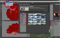 This leads me to my favorite function: Change atmosphere! This is where I spend the most time, trying out sunsets, bad weather, science fiction atmospheres, etc. To do this, you have to go to the Atmosphere tab and then to Load atmosphere (No. 1), this brings up the atmospheres menu. You have a huge list of atmospheres to choose from (No. 2). Just go and try any of them.
Note: Some atmospheres take more time to render than others, while some may take seconds, others take hours. Keep this in mind.
You can see in No. 3 that I chose a sunset. This didn't help my tree shade situation. What do I do now? Well...
 Add a light!
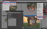
Go to the Object tab (No. 1) and then to Add light, this opens a submenu where you have 6 different light options. I'll choose Point light for this. Immediatelly after this, you can see your new light in all your preview windows (If the light appears out of the camera's field of vision, it won't appear in the main preview window).
As a default, all lights have the Enable flares option active. To change this, right-click said light on the list on the right, then go to Edit object (No. 3). This brings up another menu (No. 4).
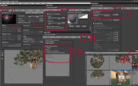 Since I'm still a begginer myself, I'll try to explain the light edit menu. In No. 1 we have the Lens flare options. I marked in a square the box you need to check or uncheck to disable the flares. You can also edit the flares' color, intensity, etc.
No. 2: Use this to Enable volumetric lighting. If you check the Show smoke and dust option, you can get very cool effects, like the light beam entering the church on the image at the very top of this page, under Believe.
No. 3. You can Enable or disable shadows. This has a lot of different uses, I'll leave that to your imagination and creativity. In No. 4 you can decide what the light will influence. This is good when you just want to make an object stand out above the rest. In 4-B I checked (not in this image) the Only objects marked below option, and then I only checked Ozz Tutorial.
For this image I also disabled the shadows in the Point light I created, this allows me to make Ozz stand out above the tree without affecting the tree's shade.
Let me make a pause here to remind you to SAVE YOUR WORK FREQUENTLY!!!
 Let's do something fun now, something that will change the future of this image forever (Yes, my mind actually works like this, I start with one idea and it makes a U-turn halfway to become something else, and no, I don't narrate things like a dramatic TV announcer to myself). Let's add water!
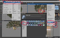
Once again, go to the Object tab and then to Add water (No. 1). This will create a whole infinite plane of water, good for the sea, bad for a pond or a pool. It will appear at ground level, you can move it up or down, depending on your picture's needs (No. 2). You can also change the water's material (No. 3) and choose from all the different types of water you get in the menu (No. 4).
I'll add another note here: Water usually takes a long time to render, and some types of water more than others. Just something to keep in mind when you work with water.
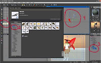 If you left-click on the Object button (No. 1) you gt a wide variety of stuff to add to your scene (No. 2). Some of this stuff you have to purchase from the Vue store, other comes in the CD extras and some comes with the software. Just try them and see what you get.
I chose Animals and then a cool whale. I had to resize it, so, I selected it (No. 3) and did what I explained before. and I also decided to delete the tree and the blackboard and moved the wale to the back (No. 4).
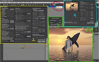 By now you must be bored, so, I'll just add a couple steps and you'll be able to go about your business.
This is where it gets interesting: Rendering!
Take a look at the camera button on top (No. 1). If you left-click it, you will render your image in the main preview window (bottom right), but since the Preview preset is the default, this will be done in a fast, not very detailed way (you can do this as many times as you want to from begining to end). If you right-click it you get an options menu (No. 2). This is an important menu, rendering time, picture format, size, resolution, etc. depend on this menu.
On the top left you have the Preset render options. Preview is the default option, as I just mentioned. Final gives you more detailed renders, and the quality increases as you go down to Broadcast, Superior and Ultra. You also get custom User Settings.
I'll skip down to Render destination. I always check the Render to screen option. This allows me to see the renders in a separate screen, not in the main preview window. I won't go into the rest of the options, you can experiment with all those, specially with the Picture size and resolution options. Aspect ratio is fun to play with.
Once you click Render you get a separate screen where the image is rendered and a smaller screen that tells you the progress and how long it will take for the image to be rendered (No. 3).
When the image is finally rendered, you get a Post render options menu (No. 4). This is fun to play with too. You can choose not to get this menu automatically, if you don't see it right away, click the button in No. 3-B. Here, you have some of the options you have in Photoshop, like Explosure, Hue, Brightness, etc. Click preview to see the changes in the image before saving them, and OK to apply them to the image and save the changes.
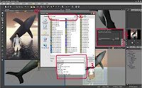 Finally, to save the image: Click the diskette button on the image screen (No. 1), choose the folder where you want to save your images (No. 2) and choose the type of file you want to save (No. 3). All the types open different windows (No. 4) where you choose the size and/or quality of the final file. I usually choose Jpeg and I move the slider to 100%. Click OK, and that's it. You're done... well, only if you're satisfied with the picture.
This is it for this tutorial. I hope I wasn't too confusing. This should get you started, and I know you'll master it in a second.
Vue is a really fun program to play with, easy to use, a really cool partner for Poser and has really professional (I think) results. I hope you have fun.
Thank you for reading this far down. And when you discover cool features that I didn't mention here, be sure to let me know, cuz that means I don't know about them. :p
One more thing: SAVE FREQUENTLY!!!
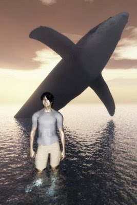
Here's my final image.
Let's start. After you install Vue and try to import Poser scenes, objects, etc. the program will ask you to specify a folder where your Poser executable file is, you'll have to locate that folder, it can change depending on the version of Poser you use. I use Pro, therefore, my file is C:/Program Files/Smith Micro/Poser Pro (in other versions change Smith Micro for Curious Labs or e-Frontier). Once there, you only have to double-click the icon that looks exactly like the Poser icon on your desktop (the .exe file). It may ask some questions depending on your PC performance and/or video card. Ready, now you can import Poser stuff to Vue.
All right, to start,
 click on the File tab (No. 1) and then Import object (No. 2), this will bring the Open window on No. 3, you will have to locate the folder where you store all your poser scenes. This will open the Import options window in No. 4, click OK, and it will take a few seconds (depending on your PC) before it shows the Poser Import options. These last options may affect your system's performance, that's why I didn't check the "Allow re-posing inside Vue" option.
This leads me to a really cool feature. If you don't like something in your scene once inside Vue, you can open it in Poser (you don't need to close Vue if your system can handle it), do all the necessary changes in Poser (pose, Mats, hair, clothes, etc.), save it and Vue will ask you automatically if you want to load the new changes, just say yes and it'll repeat No. 4 and 5, and voilá, the scene will update.
Note: Vue is a very whimsical program and it will crash with any provocation, so, try to save your progress as often as you can. Also, if you have a very heavy scene in Poser, say, 3 or 4 human figures and props, try to save the figures with their respective props as different scenes and load them into Vue separately.
 This is how your screen looks once the object or scene is loaded.
No. 1, 2, 3 and 4 are your preview screens. 1 is from the top, 2 is from the left side, 3 is the front view and 4 is where your scene renders when you click "render" (I'll get to that later). Each window has a small camera icon on the top right corner, this allows you to render each individual screen so you can see if everything's going OK. You can left-click over any of them to activate it (the top bar of the screen you select will turn blue), and you can use your mouse wheel to zoom in or out on any of these four screens. No. 5 is where you get a more accurate preview, it updates after you make any change to the scene. This takes resources, so, you can turn it off by right-clicking over it and unchecking the Auto update option.
 The gray line you see in the middle is the ground. If your figure appears in the middle, all you have to do is pull it up using the arrows around it (No. 1). If you ever built anything in Second Life, you may find this very similar, therefore, making it easier to use. With these arrows you can move anything in the scene: the ground, your figure and even the sun. With the dots you see in No. 2 you can change the size of the selected figure. The corner dots resize evenly, and the middle dots will resize unevenly, this could deform your figure. The icon in No. 3 activates the arrows to move the selected object in any direction. The letters next to it change the arrows' direction so you can move the object in a diagonal and towards the camera. No. 4 allows you to rotate the object, the letters affect the rotation as well.
 In this image, you can see the list of all the objects in the scene. If you right-click on anything in this window, you get a lot of options, you can group several objects, ungroup them, delete or edit them, etc. If there is a cross on the left of the object, it means that it's a group. For example: the Ozz Tutorial scene. It's made of 5 different figures: Ozz, the T-shirt, shorts, boots, and the blackboard. If you expand the menu, you can select each of them and move them, transform them, etc. individually.
In this image I selected the camera (No. 1) to show you that you can move it just like any other object. The pink dots in the top, front and side viewers show the camera's field of vision, and there's a line in the middle that shows you the center of the field.
 Now, let's move to fun stuff. I'll show you how to change materials. In this image I right-clicked on the ground (No. 1) and then selected Change material (No. 2). This opens a window (No. 3) that gives you a lot of options of materials. You can turn the ground, or any object, into whatever is included in the menu: metals, glasses, liquids, etc.
Before I go into No.4, I'll add that almost all of the buttons in Vue can be left and right-clicked with different results, right usually brings up menus, so, experiment on all of them.
OK, the buttons in No. 4 add different things, from water to planets (for the background) to plants and trees. Just go ahead and try them all.
 You can see in "A" on this image that I changed the ground into a green-grassy material.
In this image I right-clicked the Tree button (No. 1) and I got that window. You can see that you have a lot of options for plants, trees, bushes, etc. You even have underwater plants. Go crazy and experiment with anything you want to put into the scene.
I selected a huge Baobab tree (No. 2) by double-clicking on it.
 You can see in "A" on this image that, after I resized and relocated it, the tree is blocking the sunlight. What do we do now? Well, you have several options. One is to select the tree (No. 1) and rotate it or move it out of the way (No. 3), or you can select the Sun light in the list and move it around till the light is better for the image. This can be difficult with a tree as large and bushy as the baobab, you'd need to lower the light too close to the ground and that affects the results. Also, keep in mind that we're still in the default atmosphere.
 This leads me to my favorite function: Change atmosphere! This is where I spend the most time, trying out sunsets, bad weather, science fiction atmospheres, etc. To do this, you have to go to the Atmosphere tab and then to Load atmosphere (No. 1), this brings up the atmospheres menu. You have a huge list of atmospheres to choose from (No. 2). Just go and try any of them.
Note: Some atmospheres take more time to render than others, while some may take seconds, others take hours. Keep this in mind.
You can see in No. 3 that I chose a sunset. This didn't help my tree shade situation. What do I do now? Well...
 Add a light!
Go to the Object tab (No. 1) and then to Add light, this opens a submenu where you have 6 different light options. I'll choose Point light for this. Immediatelly after this, you can see your new light in all your preview windows (If the light appears out of the camera's field of vision, it won't appear in the main preview window).
As a default, all lights have the Enable flares option active. To change this, right-click said light on the list on the right, then go to Edit object (No. 3). This brings up another menu (No. 4).
 Since I'm still a begginer myself, I'll try to explain the light edit menu. In No. 1 we have the Lens flare options. I marked in a square the box you need to check or uncheck to disable the flares. You can also edit the flares' color, intensity, etc.
No. 2: Use this to Enable volumetric lighting. If you check the Show smoke and dust option, you can get very cool effects, like the light beam entering the church on the image at the very top of this page, under Believe.
No. 3. You can Enable or disable shadows. This has a lot of different uses, I'll leave that to your imagination and creativity. In No. 4 you can decide what the light will influence. This is good when you just want to make an object stand out above the rest. In 4-B I checked (not in this image) the Only objects marked below option, and then I only checked Ozz Tutorial.
For this image I also disabled the shadows in the Point light I created, this allows me to make Ozz stand out above the tree without affecting the tree's shade.
Let me make a pause here to remind you to SAVE YOUR WORK FREQUENTLY!!!
 Let's do something fun now, something that will change the future of this image forever (Yes, my mind actually works like this, I start with one idea and it makes a U-turn halfway to become something else, and no, I don't narrate things like a dramatic TV announcer to myself). Let's add water!
Once again, go to the Object tab and then to Add water (No. 1). This will create a whole infinite plane of water, good for the sea, bad for a pond or a pool. It will appear at ground level, you can move it up or down, depending on your picture's needs (No. 2). You can also change the water's material (No. 3) and choose from all the different types of water you get in the menu (No. 4).
I'll add another note here: Water usually takes a long time to render, and some types of water more than others. Just something to keep in mind when you work with water.
 If you left-click on the Object button (No. 1) you gt a wide variety of stuff to add to your scene (No. 2). Some of this stuff you have to purchase from the Vue store, other comes in the CD extras and some comes with the software. Just try them and see what you get.
I chose Animals and then a cool whale. I had to resize it, so, I selected it (No. 3) and did what I explained before. and I also decided to delete the tree and the blackboard and moved the wale to the back (No. 4).
 By now you must be bored, so, I'll just add a couple steps and you'll be able to go about your business.
This is where it gets interesting: Rendering!
Take a look at the camera button on top (No. 1). If you left-click it, you will render your image in the main preview window (bottom right), but since the Preview preset is the default, this will be done in a fast, not very detailed way (you can do this as many times as you want to from begining to end). If you right-click it you get an options menu (No. 2). This is an important menu, rendering time, picture format, size, resolution, etc. depend on this menu.
On the top left you have the Preset render options. Preview is the default option, as I just mentioned. Final gives you more detailed renders, and the quality increases as you go down to Broadcast, Superior and Ultra. You also get custom User Settings.
I'll skip down to Render destination. I always check the Render to screen option. This allows me to see the renders in a separate screen, not in the main preview window. I won't go into the rest of the options, you can experiment with all those, specially with the Picture size and resolution options. Aspect ratio is fun to play with.
Once you click Render you get a separate screen where the image is rendered and a smaller screen that tells you the progress and how long it will take for the image to be rendered (No. 3).
When the image is finally rendered, you get a Post render options menu (No. 4). This is fun to play with too. You can choose not to get this menu automatically, if you don't see it right away, click the button in No. 3-B. Here, you have some of the options you have in Photoshop, like Explosure, Hue, Brightness, etc. Click preview to see the changes in the image before saving them, and OK to apply them to the image and save the changes.
 Finally, to save the image: Click the diskette button on the image screen (No. 1), choose the folder where you want to save your images (No. 2) and choose the type of file you want to save (No. 3). All the types open different windows (No. 4) where you choose the size and/or quality of the final file. I usually choose Jpeg and I move the slider to 100%. Click OK, and that's it. You're done... well, only if you're satisfied with the picture.
This is it for this tutorial. I hope I wasn't too confusing. This should get you started, and I know you'll master it in a second.
Vue is a really fun program to play with, easy to use, a really cool partner for Poser and has really professional (I think) results. I hope you have fun.
Thank you for reading this far down. And when you discover cool features that I didn't mention here, be sure to let me know, cuz that means I don't know about them. :p
One more thing: SAVE FREQUENTLY!!!
Here's my final image.

miércoles, 26 de noviembre de 2008
It's a man's world
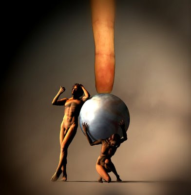
OK, it worries me that this pic can be misinterpreted.
The idea came from learning that November 25th was the International day for the elimination of violence against women. That made me think and think about the countless ways men use to humiliate women, from physical and psychological violence to lower salaries and anything in between. And one of the things that seemed more offensive to me was religion (and I say "religion" not "faith"). And by religion I mean the human institution, not God.
This comes in the form of God being portrayed as a man, the angels and even cherubs are always male. The first two women, Lilith and Eve are not exemplary women, the first was depicted as rebellious and was practically erased from history. The second was the weak one that listened to the snake and caused poor little helpless Adam to be banished from Eden. Oh, that evil temptress!
And ever since, we have been taught that women are to blame for all our problems, poor little men, so innocent we are. And that's what I try to represent with this picture. Women have to carry the weight of the world in the form of pregnancy, raising families, menstruation, etc. On top of that, religion considers them second class humans, byproducts of men (y'know, our ribs), not even worthy of being priestesses, and all while men watch and say nothing. Nothing helpful to women, that is.
Anyway, I could go on with this, but I don't want this to be even more boring. LOL
Thank you!
Etiquetas:
"human rights",
"violence against women",
religion
Suscribirse a:
Comentarios (Atom)


